How to Use Showit Templates – Step-by-Step Guide
Step 1: Add Your Template to Showit
Getting started with a new Showit template is easier than it looks. First, make sure you have a Showit subscription that supports the features you need (Get a month FREE here). For example, to use a blog you’ll need at least the Starter Blog plan, and to migrate an existing blog you’ll need Advanced Blog. Once you’re ready, log in to your Showit account and open the Design App (the blue button that says “Edit My Website”). Choose Add Design To Library in the top-right corner. If you’re already in an opened design, you’ll click on your name in the bottom-left corner to view the user menu, and choose Add To Library. A dialog will appear asking for a share key (this is the code you received with your template). Paste your template’s share key into the field and press Enter. You will see a preview of the design – click Add Now to import it into your account. The template is now in your Showit library and ready to use.
- Log into your Showit account
- Open the Design App
- Navigate to Your Designs
- Click Add to Library
- Paste your Share Key
- Click Add Now
Step 2: Learn Showit’s Design Editor
Once the template is added, click Edit or open the design to customize it. In short – the Showit interface is split into three panels:
The left panel lists your site’s pages and canvases. Clicking a page name and then the Page tab, expands its canvases (sections). Each canvas can contain multiple Canvas Views (like slides) if the design uses them. A special Site Canvas (marked by a diagonal line when hovering with mouse) can be placed on multiple pages – changing it on one page updates it on all pages.
The center panel shows your site preview. By default it shows the Desktop view, but you can toggle to Mobile using the icons at the bottom. Adjust the zoom with the zoom buttons or your mouse. It’s wise to design with both views in mind: Showit allows “splitting” desktop and mobile styles if needed, but be careful that content still looks good on the other device.
The right panel shows settings for whatever is selected (a page, canvas, or element). For example, clicking on an image will show its Image settings, and clicking on text shows font and size options.
- Left Panel → Pages
- Middle Panel → Site Preview
- Right Panel → Settings (for whatever’s selected)
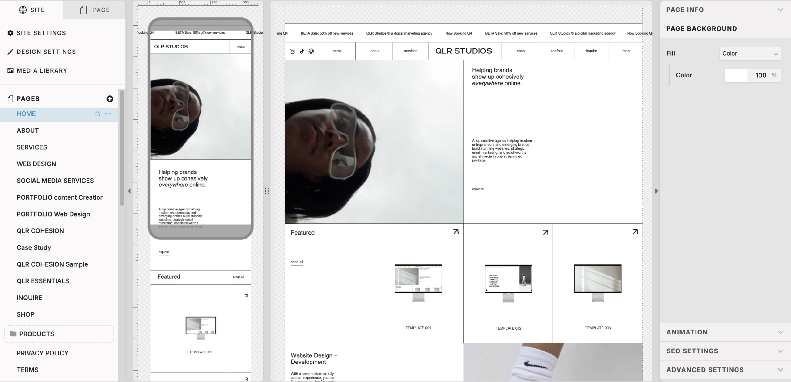
Figure: The Showit Design Editor. The left sidebar has your Site/Design Settings and pages (including blog templates). The middle is your design canvas (desktop/mobile toggle below), and the right sidebar shows properties for the selected item.
Step 3: Set Your Site Settings & Design Settings
Before diving into edits, set your global styles. In the left Site Panel, click Site Settings (the gear icon under the “Site” tab). Here you can update things that apply site-wide.
- Site Info: Set your site name (for the editor only), favicon, and custom domain. Under Custom Domain you can enter your domain name to start the connection process (but don’t finalize until after DNS is set) – we’ll touch on this in a sec.
- Social: Under the Social tab, paste the URLs for your social media profiles. Any social icons on your site will automatically use these links.
- Integrations: In the Integrations tab you can add tracking codes globally. For example, paste your Google Analytics Tracking ID or Google Tag Manager code here. Showit also supports Meta Pixel and other integrations. Any code entered will be injected into every page’s header automatically.
Next is Design Settings (also under the left panel). This is where you define your brand’s colors, fonts, and buttons. As you adjust, you can preview a sample page to see how the palette affects your design.
Under the Fonts tab, you can choose Google Fonts or, to use a custom font, first upload the .woff file of your font to the Media Library, then it will appear in the font dropdown list. (Follow the Font Squirrel link to convert a font file to .woff if necessary) Be aware that any color or font you set here will apply to the entire site; this is powerful for consistency but means that overriding it for one section requires extra work later. If you want mobile and desktop styles to differ, remember you can “split” a setting and customize the mobile view independently.
Step 4: Upload Your Media (Images & Videos)
Showit’s Media Library (click the image icon in the left panel or the toolbar) is where you upload all of your site’s images, videos, and custom font files (like .woff fonts). You can add folders to keep files organized (e.g. images, logos, icons).
Supported image formats are JPG, PNG, and GIF. For any video that you host on Showit (like a canvas background video), upload an MP4 with h.264 compression – and keep it under 8MB to ensure fast loading. (Showit enforces an 8MB limit on hosted videos.) If you have longer videos or need higher quality, upload them to Vimeo or YouTube and embed them instead: Showit has built-in video player widgets for Vimeo/YouTube. For very short animations (like a subtle loop or promotional clip), you can also convert them to GIFs (~10 seconds) and upload as images.
Once your files are in the library, adding them to your site is easy. To replace a template image, select the image in the canvas (you may need to click it twice if it’s behind a shape). In the right sidebar under the Image tab, click the “Swap Image” button and choose your new image from the library. If an image isn’t selecting properly in the editor (sometimes a border shape is layered on top of it), check the left panel to ensure the image itself is highlighted.
Step 5: Edit Text & Adding Elements
Editing text on your template is straightforward. Click on any text box and simply start typing to replace the placeholder text with your own. The right panel will let you adjust font size, color, line height, letter spacing, alignment, etc. (These may already be set by your Design Settings defaults.) To add new images, shapes, images, galleries, videos, or custom embeds, use the Add Elements buttons (bottom icon bar). Showit allows you to adjust or even hide certain elements for mobile: each element has a visibility toggle for Desktop vs Mobile in the left panel.
Step 6: Using Canvas Views & Animations
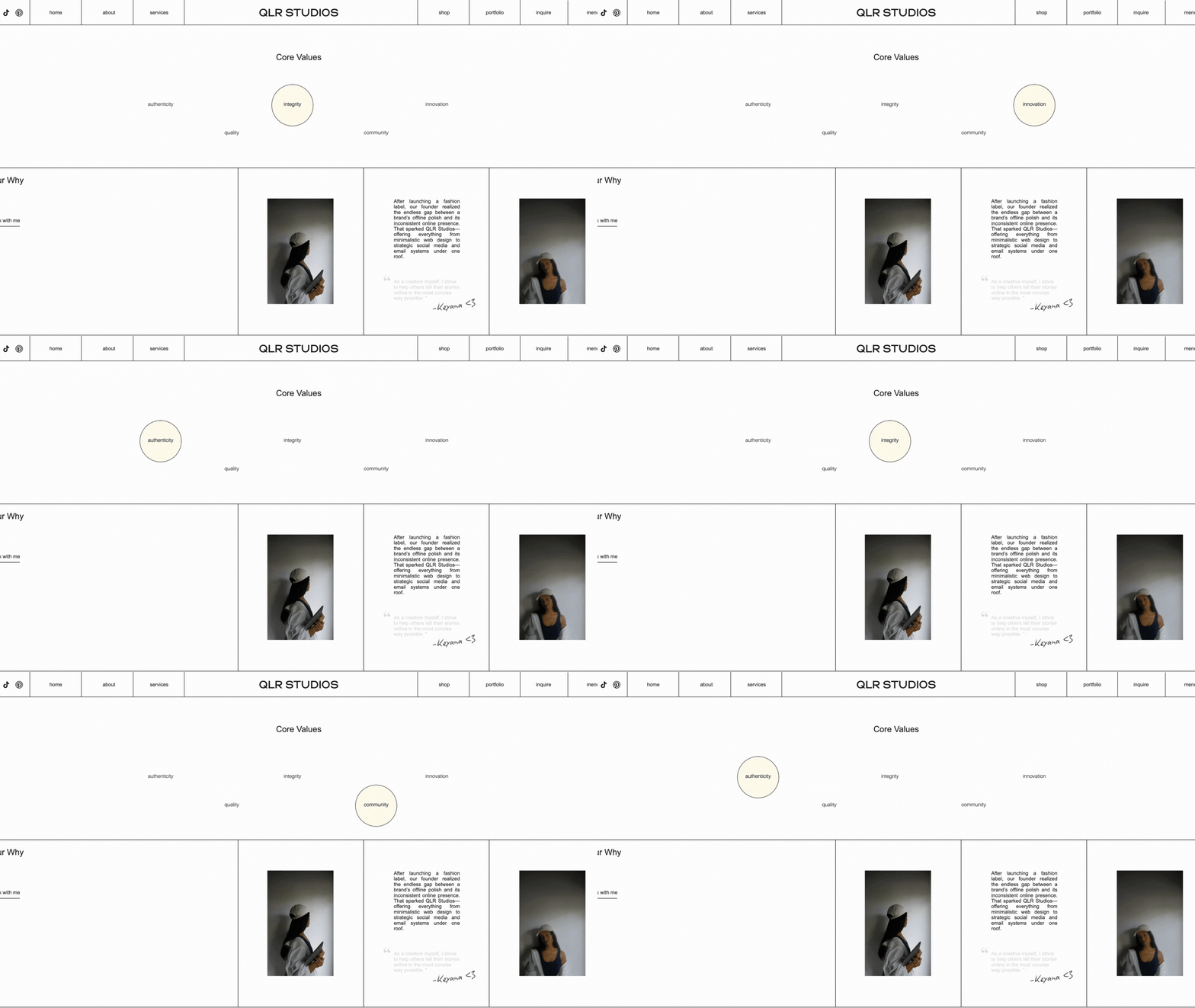
Some templates use Canvas Views to create slideshows or animations within a single canvas. A canvas view is like a slide that is part of the same section. To understand this, think of each canvas as a slide deck – each view is a different “slide” with its own content. In the left panel, when you expand a canvas, you will see individual views listed under it. By default, View 1 shows first, but the canvas can be set to auto-advance to View 2, View 3, etc., creating a slideshow effect.
To edit the content in each view, simply select the view from the left panel and then edit the elements as usual. You can stop here, as your template should already have the following settings done for you, but for those who’d like to make changes – In the View Transitions tab (in the right panel when a view is selected), you can set the transition effect (fade, slide, etc.), duration, delay, and direction. If you want the views to advance automatically (like a timed slideshow), toggle Auto Advance View on in that panel. Then set how many seconds between slides. Some templates have next/prev arrow icons that allow visitors to control the slideshow manually.
Step 7: Link Buttons & Mobile Pop-Out Menus
While most buttons in your template are already routed to their corresponding pages (i.e About button → About page), if you want to route them elsewhere like a new page or URL, you can do so by clicking the button/text and using the Click Actions tab in the right panel.
Don’t forget to check the buttons in your pop-up menu. Many templates include a mobile “pop-up” or “hamburger” menu. This is typically built using Site Canvases. Inside that canvas are your mobile navigation links. To see and edit this menu, select the “pop-up” canvas that’s usually at the bottom of every page (you may need to click through the “Edit Layer” button that appears or find it under Site Canvases).
Tip: For blog category page buttons (like blog categories), use the full URL (see the Blog section below).
Step 8: Forms & Contact Pages
Showit includes built-in contact form elements that you can place on pages like an “Inquire” or “Contact” page. These standard forms will send submissions to the email you used when signing up for Showit. To customize a form, simply click on each field and change the placeholder text or label. Simply copy and paste one of the text boxes to add more or select and delete to remove, if needed.
Each manual contact form canvas actually has two views: View one shows the form fields, and the view two (displayed after submit) shows the “Thank you” message. To edit that confirmation text, select the second view of the form’s canvas and edit the text there.
If you prefer to use a third-party form (Mailchimp, ConvertKit, etc.), you can embed it easily. To make this easy for you, our templates already have a canvas called “Form (embed)” – unhide it using the toggles in the left panel and paste your embed code into the embed box. You can remove or hide the manual form canvas if you’re not using it. Or you can and add an Embed Code element (from the toolbar) yourself. In the right panel, and paste your form’s embed code or inline HTML.
Tip: If your email platform also requires a header script (for example, ConvertKit often asks you to paste a JavaScript snippet in the page head), click on the Canvas (not element) in that page and go to Advanced Settings in the right panel. Paste the code into the Custom Head HTML box. Then paste the “inline” form code into the Embed element.
Extra Step 9: Blog Setup (WordPress Integration)
Showit designs integrate with WordPress for blogging. If your plan includes a blog, you’ll need to request the Showit team to set up or migrate your WordPress blog (there are buttons for this in Site Settings > Blog tab). Once the blog is active, we provide three special pages under Blog Templates (in the left panel) — typically named Blog, Blog Single Post, and Category. These templates define how your blog and posts look, but the actual blog posts are written in WordPress.
Accessing WordPress: After setup, you can click the Blog Admin button in your Showit dashboard when you first log-in (see image above) OR go to yourdomain.com/wp-admin to log in to WordPress. Use the credentials emailed to you. Once logged in, you’ll see the WordPress dashboard. To create a new post, in the sidebar go to Posts → Add New, enter your title and content, and hit Publish. The content will automatically populate into your Showit-designed blog templates on your live site.
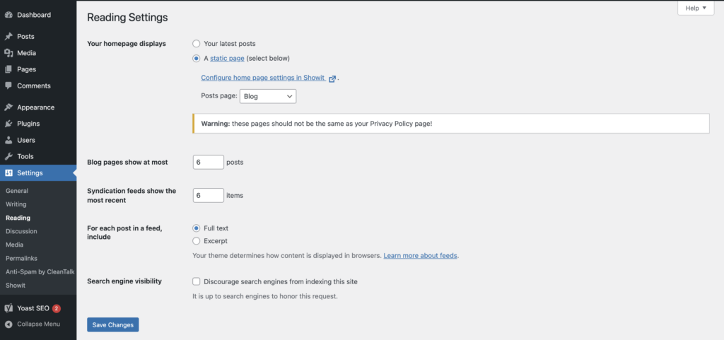
WordPress Settings: In WP Admin under Settings → Reading, make sure the page for posts is set to your Showit “Blog” page, and adjust the “Blog pages show at most” number to match your template (for example, 6 posts for our Template 01). Categories and tags in WordPress will filter your blog. In Showit, if your template has category pages or a featured-posts section, use the Link to Category and Posts View Lookup features:
- To link a button to a blog category, edit the button, go to Click Actions → Link to URL and enter
https://yourdomain.com/category/your-slug/(replaceyour-slugwith the category slug from WP). - For a “Featured Posts” canvas, set its Canvas Type (in right panel) to Posts View Lookup and enter the tag slug (e.g. “featured”) to pull only tagged posts. This requires that you tag your chosen posts in WordPress with that slug.
These settings ensure your blog categories and featured sections display the correct posts.
Optional Step: Shop Integration
A) Shop Integration – Shopify Buy Buttons (Recommended)
Alternatively, you can use Shopify Lite/Starter plan to sell with Shopify buy buttons. On Shopify’s site, create your products (physical or digital). Then use Shopify’s Buy Button channel to generate embed code for each product or collection. In Showit, add an Embed Code element and paste the Shopify code into its settings. You can style the button how you want within Shopify or we recommend leaving it as is and resizing the the embed box to fit the button that’s already in your template. Place the embed box on top of the buy button that’s already provided in the template’s design, and just turn down the opacity in the settings right panel – so when users click the stylized button that came with the template, they’re actually clicking the invisible Shopify Buy Button that’s on top.
When a visitor clicks the Shopify buy button, a secure checkout pop-up (hosted by Shopify) appears. The cart icon can be embedded anywhere with “Add to Cart” buttons. Tip: Avoid putting the embed code inside hidden canvases or auto-rotating views; keep it visible at all times. Also, if you place multiple buy buttons for the same product on one page, you’ll need to tweak their code snippets slightly to avoid conflicts (Shopify’s known quirk).
For digital products, you can use Shopify’s digital downloads or integrate SendOwl via Shopify. Once products are added to Shopify, simply embed each product’s buy button in Showit. If you want a “Cart” icon to follow the user, create that as a floating element and link it to Shopify’s cart.
B) WooCommerce (WordPress)
If you want an online store on a Showit site, you have two main options. One is using WordPress plugins (like WooCommerce). Showit fully supports WooCommerce on an Advanced Blog plan. With WooCommerce enabled in your WP dashboard, product pages will by default use the “Single Post” template in Showit. You can also create a custom product page layout: duplicate your Blog Single Post template, add a Post Title placeholder and a Post Content placeholder in Showit, then in that canvas set the WordPress Template to Custom and name it single-product. This tells WooCommerce to use that layout for all products.
Basic product listing pages (shop, cart, checkout) are also provided by WooCommerce. You’ll need to ensure your WooCommerce Settings → Products → Shop page is correct in WordPress. Showit requires a “Page” template for Shop/Cart to render, so ensure your WooCommerce shop page is named appropriately. Note that WooCommerce handles checkout and payments; Showit just displays the design around it.
Important: Showit does not process transactions. WooCommerce will handle the cart and checkout flow on your domain. Also, WooCommerce’s default reviews are not supported, so if you need reviews use a Woo extension as suggested.
Step 10 : Connecting Your Domain and Publishing
After finishing your edits, it’s time to launch. In the Showit Design App, click the Connect Your Domain button (usually at the top). Follow the prompts. If you have a blog, you’ll answer questions and possibly trigger a blog setup/migration request. Once Showit indicates success, note the DNS records it provides (these will be emailed or shown in your Showit account).
Next, go to your domain registrar (e.g. GoDaddy). In your DNS settings, update the A record to the IP address Showit gave you, and add any CNAME or additional records as instructed. (Showit’s support docs and the Showit dashboard can show you the exact values.) This step points your domain to Showit’s servers. Wait for propagation (can take minutes to a few hours).
Back in your Showit account under Domains, click Check Site or Verify. If everything is correct, Showit will automatically issue an SSL certificate for you. Finally, hit Publish in the Showit app. Now your site (with the new template) should be live at your domain!
If you run into trouble, remember Showit offers 24/7 chat support. And if you used a referral link, ensure your plan is set up (they often give a free first month). Once live, visit your new URL, and you should see your Showit site in action. Enjoy your beautiful new design!
Sources: Official Showit documentation and help articles were used to compile this guide. Each step follows recommended Showit procedures and settings.
Leave a Reply
Not ready to inquire yet?
Take the 2-minute quiz to see which system fits your brand right now — no email required to see your result.


